Wednesday, June 11, 2014

Mixed Media


Questions
Did you learn new techniques or processes as part of the work for this project?
New techniques that I learned in the process of creating my mixed media collage was the effect that gel medium has on paper.  My favorite new technique that I will be using in the future was the clear tape effect.  I used this on several pictures in my piece and I love the effect it gives.  After I tried this effect on different types of paper I noticed it worked better on magazine paper and it looks cooler if the paper is white.
Did you gain skill with familiar materials?

I thought that I became better with placement and piecing together the pictures that I found.  I've done mixed media before on my own and I noticed that with this piece I emphasized the idea of making the pictures fit together rather than just pasting them down with hard edges.  
What is this artwork intended to say?
This artwork is intended to intrigue the viewer and to make them feel a subtle happiness.  With the theme being Amusement I wanted my viewers to see the piece as something to make them smile.  With the theme of amusement I also added a vintage feel to it so the amusement featured in the pictures were only hints of happiness rather than a loud expression of amusement and happiness.

What issues are you examining through your artwork?
No issues were examined through the piece.  There was only amusement.  The only thing examined through my artwork was happiness and how it can be subtle and gentle.

How is this artwork about who you are or what you like?
This artwork is about who I am because it features things that I find amusing.  The artwork above also features my own movie ticket stubs and plane tickets which are two things I enjoy receiving. Mixed Media I feel like is a more personal representation of artist  because of how broad the mediums can be. Artist can have as little variation as they want and this really reflects on what type of artist they are. 

Did you ask another student for feedback during your work process?
I did ask other students for feedback during the creation process. Often times it was asking about whether I should add a specific picture or where should I add this in or how does it look. The feedback really helps me out because it gives me a completely different perspective on my artwork.

Did someone help you understand important information or inspire you?
My table was a source of constant inspiration. In the creation/idea phase Kalabria was a source of helpful information and ideas. She helped me explained on my theme and I helped her as well. We both grew off of each others original ideas. Without her help I may not have been able to produce the mixed media piece that is featured above. I am grateful for her ideas and knowledge because overall it helped me be a better artist.

Thursday, May 8, 2014

Sticky Situation With Repetition


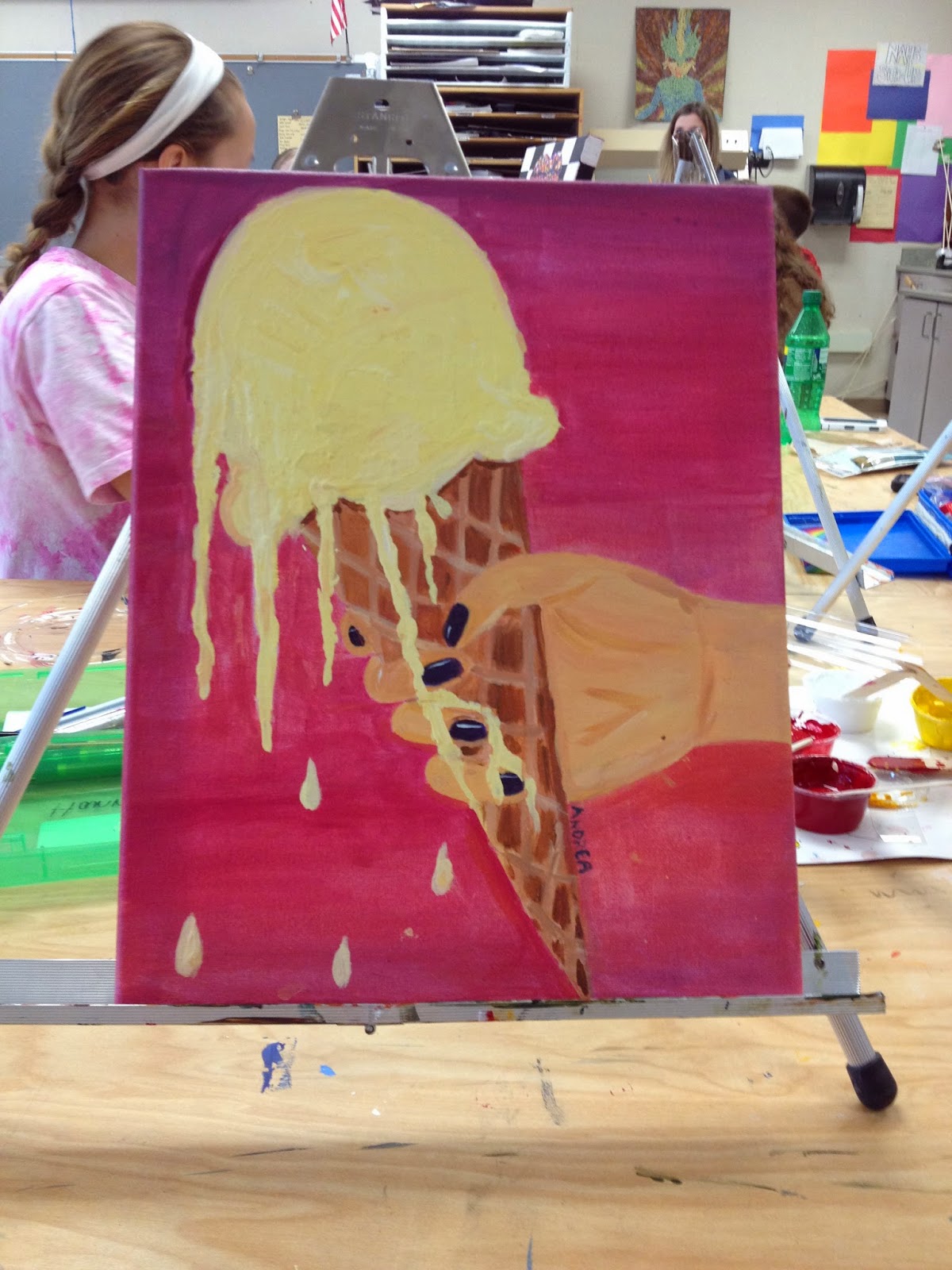
Sticky Situation 
These were some of the references I used to create the Sticky Situation piece.
After using these references I created sketches combining aspects from each photo, which then contributed to my final piece.


These photos are in-progress pictures of the ice cream cone.

Artists Take Risks
Did you try something that you weren't sure about as part of this project?

When I began creating the ice cream part of the painting I wasn't sure about Ms.Rossi's suggestion of using the palette knife to create the creamy texture of real ice cream cone. I was unfamiliar with the palette knife and its capabilities to create texture in acrylic paint. I also wasn't sure about making the hand. I was uneasy about the dripping ice cream cone because I knew I would have incorporate a hand. After I painted it and added values into the hand it became the least of my worries.

Did you pick a material or technique that was new or different over something that was familiar?
A new technique that was different was the palette knife instead of using a paint brush to show texture and values.

Artists Solve Problems

How did you respond to challenges that occurred as you worked?

The challenges that I encountered included of not having enough paint for one area and having to recreate the same color again. This happened multiple times with the cone and the hand. I tried my best to recreate the color and if it wasn't the same shade I used that shade to add more values to those area.


Did your work take an unexpected turn due to a mistake or did something happen that was unplanned?

Originally I planned keep the background a light purple color, and I moved on to the items in the foreground. Once I began looking at my art work I decided that a gradient would be more appealing to have rather than a light purple. Since I had all the items in the foreground painted I had to carefully paint the background a gradient without overlapping or painting on the items in the foreground. I didn't plan on making my background a gradient but it was a unplanned part of my art work that I'm glad I got to incorporate.

Artists Create Original Art

How did you use your own unique ideas in your work?

I used my unique experience of having ice cream melt down my fingers to create this sticky situation. I hate when my fingers are sticky and I love ice cream. When ice cream melts, sticky hands are unavoidable. Ice cream melting down your fingers is a literal and figurative representation of a sticky situation. Its a sticky/bad situation to be in because everything you touch will take on the sticky residue. Its literally sticky because ice cream is a sticky substance.

Did you use a source for inspiration, then combine it with your own ideas to make it original?

My source for inspiration was a combination of experiences, photos, and my tablemates. Then I combined these ideas with my own original ideas to complete my piece. I think its important to combine inspiration and your own ideas because it produces the best results. Taking someone elses idea and transforming it to fit your ideas and style makes you a better artist.

Thursday, March 27, 2014

Up close and Personal Final


While creating this piece of art I didn't really analyze what I was creating until after I finished doing most of the yoohoo chocolate milk.  My tablemates were the ones who really made me take a step back and look at what I was creating.  After holding it up and stepping away from it I was really pleased with the results.  The colors were very vibrant and the drink looked realistic.  After I analyzed my project it helped boost my confidence in completing the second drink.  Yes in the idea's phase of the project when I considered doing the juice-boxes I realized that I would have to recall my previous knowledge of two point perspective to make this piece look realistic.  
Throughout the process I did ask my tablemates what color I should color the Hi-C juice box and they were the ones who gave be me the idea to make it that pinkish orange color. The orginal Hi-C juice box is yellow and I didn't want to put two yellow juice boxes next to each other so I asked for an outside opinion and I'm pleased with the response I got. That color was a very good choice to contrast with the yellow. My tablemates constantly inspire me to excell in class. They inspire me to push my self by choosing challeging concepts. They also help point out areas of weakness in my artwork. Without their help I wouldn't be living up to my full potentional; I really appreciate their outside input. 
The unique ideas used in my artwork I think makes it standout from others. The idea of juice boxes was not a thought in my mind when the up close and personal theme was introduced. I used my own unique ideas by using my own pictures. Another unique idea I used is to put my birthdate as a best used by date. All of these things help make this piece one of my favorites. As an artist I love seeing unconventional ideas because it provokes thought and inspiration in the viewer which is what I ultimately would like to achieve with each art piece.  My source of inspiration was originally my photo then I looked at other juice boxes and different flavors to help get my creative juices flowing. By combining the outline of the original Hi-C juice box and using my own colors I put a unique twist on the artwork. The method of have a source of inspiration then adding your own ideas makes the art more of my own. 

Wednesday, March 26, 2014

Experimenting With New Mediums


     The lollipop piece was made using colored pencils.  I enjoyed using colored pencils and I learned how to layer the colored pencils.  The layering technique helped me blend the colors together with ease.  Colored pencils were already a familiar material for me but I gained the proper skills and techniques required to use these tools to create pieces that looked like the actual item.
     The soda can piece was made using oil pastels.  Throughout the process of using oil pastels I learned how messy it can be and how smooth the texture is once its on the page.  In this project I used a technique I learned in art 1 which was to shade in the same shape that the object is to give it a realistic look.  I also used the start with the medium value first technique.  The oil pastels were the same as the colored pencils.  Since I've used both before I did gain skill with familiar materials.
     The transparent candy wrapper piece was made using chalk pastels.  Chalk pastels was a new medium that I learned to love.  Out of all three pieces this is my favorite one.  The techniques were the same as using the oil pastels, but I gained skill using an unfamiliar material.  I enjoyed all of the mini lessons because they helped me refresh familiar materials with new and familiar techniques that help prepare me for my final piece.

Wednesday, March 12, 2014

Scientific Project

Scientific Project
1.       What where some of your design solutions to the theme Scientific?
Some solutions I had to portray the scientific theme included showing nature and technology which are both aspects of science.  The combination of both these helped show the theme of science.  I also think that I did a good job with taking both these generic science themes and putting a unique twist on it to create my piece.  
2.      How beneficial were the mini lessons in the success of your project. If they were not beneficial please explain as well.
The mini lessons were very beneficial to me. These lessons gave me a chance to test out all the mediums available to me for the project. The mediums that I was glad to have a mini lesson on were the charcoal and pen. I never really knew how to use either of these and the lesson helped me become more confident in what I was creating because I had a variety choices.
3.      How did you show contrast in your work?
In my work I showed contrast by incorporating pen and pencil. The focal point being the balloon and the globe which were in pen and the nature background being in pencil. This background also included thorny vines in pen to help create contrast within the plants. I also contrasted the idea of technology and nature which are opposite concepts.
4.      What medium did you decide to use? Why did you choose this medium over the others?
In the beginning I wanted to just incorporate pencil because I was most comfortable with this medium.  As I worked through my project Ms.Ms. Rossi suggested that I also use pen. I considered this advice and was able to use both pen and pencil to make my final piece. I'm glad she offered this suggestion because it added contrast and a focal point to my piece.
5.      What techniques did you use to create this work?
The techniques that I used to create this piece involving the pen was invented. I invented a swirly shape to show contrast within the building and to show depth in the balloon. I also used the swirly pattern to show where the continents are on the globe. For the pencil part of this piece I used shading to show the lights and darks within the plant steams, leaves and flower petals. I also tried to show texture with my pencil work.
6.      We encourage risk taking in art. Risk taking can be as simple as trying a new technique or learning about a new medium to as complex as trying something totally new.  Did you take any risks with this project? Explain.
I think that the combination of using a new medium, drawing plants and really trying to create contrast with my art work was risky. I had no idea how this piece was going to turn out when I began. The vision that I had within my head changed as I continued creating my project. Using pen was definitely a risk because I've never used pen before. I'm glad I took that chance though because I learned that I like pen a lot more than pencil. Another risk I took was the idea of having a city within a balloon inside a dense forest. This idea I felt was definitely unconventional and took a lot of brainstorming to come up with.The other risk I took was using nature and plants as my background. I had to find a lot of references to get different leave shapes,styles and texture before I felt that my drawing accurately displayed a dense forest. 
7.      Discuss your overall experience with this project.
Overall  I had a good time creating this piece.  It was difficult in the beginning adjusting to the process of having a theme, then creating our ideas from there but it got easier as I kept going.  I had fun using charcoal and pen for the first time.  I'm glad that I pushed my self to try a different medium.  My piece wasn't exactly what I planned in my head but it turned out better than expected.  Although I struggled in the beginning I'm happy with the result and I will use my challenges to help me create better art in future projects.   


Friday, December 7, 2012

Anamorphosis Critique

Anamorphosis Critique
Colored Pencil Anamorphosis
1. Describe the process you went through to change your object into the correct perspective to create the drawing. This is when you were in the lab.
When we entered the lab we were instructed to open up photoshop and distort an image we would want to draw.  These images were chosen by us and they varied from food to game pieces.  The scale of the drawing had to be exaggerated to get the result I wanted, so I made sure to change the scale width and height according to my preference.

2. How did distorting and stretching the object allow for you to create a drawing that would look different to the viewer?

When I distorted my image it transformed the perspective of the image.  Since the perspective was distorted we used grid lines to guide us.  After creating the overall shape, we used values and shadows  to help the image appear to be standing up at a certain perspective. 

3. What were the most important concepts in the project to make it successful? 

The most important concept in the anamorphosis critique was exaggeration.  To get the final product the way I wanted it I exaggerated the top of my object like i was told.  Another thing that made this project successful was the use of colors and blending them in to make the product realistic.

Game Drawing

Game Drawing 


Overall I thought this art piece wasn't one of my best.  I liked the process of the piece though, even thought the outcome could have been better.  I feel that this perspective piece was successful, but there were areas that could use more work.  What worked was the colors and the reality of the perspective.  I used a light watercolor wash then color pencils to overlap and bend in the colors.  What didn't work was the overall composition of the art and the gradation between the colors. I feel that I should have used colors to highlight areas.  If  I was able to do this project over I would plan ahead more and use different colors.  The most difficult part was using my eye instead of using a ruler to align were the objects would be placed. This was the hardest part because everything had to lead to the vanishing point which takes time and practice. I would also put in more shadows and define the horizon line more to make this piece better.  I learned that the process of creating pieces are more important than the final product.

Thursday, November 29, 2012

Famous Landmark or Transportation Stencil Critique

Famous Landmark or Transportation Stencil Critique

Word Bank: Use these vocabulary words in your responses. Please underline or make letters bold when you use them. 

Stencil                 Spray Paint       Xacto Knife        Positive/Negative Space
Composition    Collage                Photoshop        Threshold              Contrast

1. Explain how you changed your photo in the lab to create a stencil.
When our class was in the computer lab, we were told to use Adobe Photoshop to change the image and make it black and white.  I did as instructed and this created Black and white image  representing postive and negative space within my document. To acheive the black and white appearance in photoshop there was a button named Threshold that we were instructed to click.

2. When creating the collage background explain your choices of colors, materials (magazine paper, books pages, etc), and placement. How does it relate to your topic? If no relation discuss general idea.
Once I decided that I wanted to create a rollercoaster stencil, I searched for things relating to the fair, waterparks and bright colors to add to my collage.This search then turned into anything that appealed to me and I disregarded the fair theme.  The lines in each cliping were ridged.  The general idea was to created something that appeal to everyone using a wide varity of colors.

3. Discuss the way positive and negative space was used to create your stencil.
The postive and negative space was used to create the stencil.  We used these elements to contrast with the other.  When I cut away the postive space with the Xacto Knife  the stencil was left with mainly the details in the image.

4. When using the xacto knife, explain the safety procedures, how to use the knife and any challenges you had to overcome while cutting.
 
When using an Xacto Knife there were many guide lines we need to follow.  Before I was able to cut I had to make sure there was a hard surface underneath the paper I was cutting.  The Xacto Knife is sharper than it appears so I need to cut away from myself, and take my time while cutting.  The main challeges I needed to overcome was pressing deep into the paper without cutiing to deep and staying safe without cutting myself.

5. How was your experience with the spray paint? Discuss how color choice is important, placement of stencil, and any other concepts you noticed while creating this. 

Color choice  played an important role in the overall compostition of your artwork.  When I cut way at the positive space a better choice for spray paint would be Black so the Negative space is highlighted.  The placement of the stencil helped the compostition as well.  If the Stencil wasnt steady or a little off it would make the art look messy.  I noticed that it is very important to plan ahead so that I would be  ready for anything. 

Monday, October 29, 2012

1.     Describe the overall composition of your artwork (balance, unity, rhythm and movement). 
 
    Overall my artworks composition was very nice.  Each element of composition I believe was executed well. The picture was balanced with an equal amount of negative space and positive space, it showed movement with each texture, it was put together nice and it has a pretty good rhythm.
  
2.     How did you add texture and contrast to your print? Is this important? Why?
 
To add texture to my print I used a  carver and the different widths of the tool to create multiple types of texture.  With the texture I had to balance it out, so there was contrast. I used the same tool to add texture and contrast to my print.  This is important because you no longer have values to show your image to make it look real.
3.     Explain how you used positive and negative space to show your image.
 
The positive space was used to create my main subject which was the Gilder, the negative space was the back ground and detail of my print.  I had to use a good contrast and detail to have my image appear.
4.     Describe the craftsmanship of your print. (How good the project is technically crafted
 
The technical craft of my work I believe could have been better.  Although the print was inside the lines correctly some of the ink was over whelming in parts and lines weren't deep enough.
5.     Were you able to achieve depth by showing a foreground, middle ground and back- ground? Explain.
 
I was able to show depth and background by including a  foreground, middle ground, and back ground.  The images in the background were smaller than the other images in other grounds. This ultimately creates the illusion of the animal being closer than everything else.

6.     Explain your experience with Printmaking. What were the obstacles and advantages

This wasn't the first time I've done printmaking but some of the elements were new to me.  overall i had a very good experience, for someone who has never done printmaking I would say that care full planning makes the execution a lot better.  The obstacles in printmaking were carving out the linoleum, and applying ink.  The advantages of printmaking is being able to create the same copies over and over again.

Thursday, October 4, 2012

Chalk Mural Critique

                                                                                                                                                        
Self evaluation (must write at least 3 sentences for each question)

1. Explain your experience working on a team and executing your ideas for the mural.
 
I liked the experience of working with my group.  It was very interesting hearing from everyone and the ideas they all had.  Each idea was very intriguing, and it was very had to pick which idea we would choose.
2. Explain the importance of collaboration when working on a team.
It is very important working in team, because you get ideas from different people that mean different things.  Collaboration is very important because it's when a group comes together as one to make a decision.  With out collaboration there would be a lack of communication which is needed to succeed within a group.

3.  How successful was this project? Explain how and why.
 
This project was very successful in my eyes.  I believe this because it turned out better than expected everyone had something to do and there were all very cooperative with each other.  It was successful because we planned everything like we were in instructed to do and mapped out our ideas before attempting the final piece.

4. Explain how you feel about creating artwork that others can interact with. Ex. Involving the whole school? 
 
The whole interaction part is smart in my eyes.  It engages people and makes them interested in my artwork, which is the whole point of creating art.  Art is my way of expressing my feelings and i make art to inspire people.  What better way to inspire  multiple people than to get them involved. 
 
 
Print Sketch Critique

1. Why is texture so important to have in your sketches?
 
Texture is important in this piece especially, because were not using shading to show value.  The next best thing would be texture using lines and different patterns. 
2. Why is it necessary for you to have several references of each animal and each background? Explain.
 
References are necessary to avoid copying an image.  The reference you got aren't your own so you can't copy them, they are to be used as outlines or something to get you started when you are about to create a piece.

 
3. When you look at your sketches are you able to see which sketch is the strongest and will make the best print? How do you know this? 


When I look at my sketches I can see which parts are the strongest from each.  I'm still having a hard time choosing which sketch is the strongest out of all three.  The one that would be the strongest would contain multiple texture differences, the use of lines in place of shading and contrast between positive and negative space.

Thursday, September 20, 2012

Value Portraits Art Critique

Value Portraits Art Critique
                                                                                                                                                        
Self evaluation (must write at least 3 sentences for each question)
1. Explain the process you went through to develop your drawing.
Some steps I took when creating this piece was finding the values from a black and white picture, then shading the back of the paper to create the transfer effect.  This made the values I circled transfer onto my sketch book.  After that I used my value chart to match the original photo values in her face.
2. Explain how you found the different values in the portrait?
With the tracing paper on top of the original photo, I taped them together.  After they were taped I held them up to a window, that was used like a light box to circle and find each different value in the photo. Holding my photo up to the window made it very easy to find the values in the picture.
3.  Did you achieve a full range of the different values within your portrait?  How?
I believe that I used a full range of the different value's in my portrait.  In my portrait I went from light to dark in the best way possible.  I was able to do this with the help of my value chart, by matching up the values in the photo.
4. Describe your craftsmanship.  Is the artwork executed and crafted neatly?
My craftsmanship was pretty good I thought.  My artwork I believe was neat and clean, I made everything as cleanly executed as possible.  Something I could have fixed with the execution was how clean my shading lines were.  I followed the directions of this value portrait to the best of my ability.
5. List any obstacles you had to overcome and how you dealt with them.
Some obstacles I faces were finding every value in the picture, and using every color in the value chart.  I examined  the photo closer to find every detail and I made sure there was a color every spot. Without these obstacles I don't think this portrait would be as fun.


Friday, September 7, 2012

Vaule Study Drawings


1. Describe your overall thoughts on the final piece.
I thought that it was a good project to show how to add,  value to 2-d shapes.

2. if this was a group project, what was your contribution?

3. How successful do you feel this piece is and why?
I feel very sucessful about this project, I felt that I did my best on this piece. I tried my hardest and took my time when I was creating it.

4. What worked about this project? What didn’t work?
What worked was the blending of specific oil pastel colors which made the figures look a lot more like 3-D objects.  What didnt work was how easily the oil spread all over your fingers and the black paper.

5. If you were to do this project over again, what changes would you consider making?
Some changes I would consider making are using different colors that work well with each other.  I would also consider changing the position of the shapes and which planes they were on.

6. What was the most difficult part about completing this piece and why?
The most difficult part was controlling the oil pastels and how much you put on.  Even after practicing it was still very hard to blend without geting to dark too fast.  This was the hardest because its very easy to scrible on your work but it takes time and practice to make quality art.

7. What did you learn from this piece?
I learned a good  amount of things from this one project.  I learned how to shade, blend, and how use oil pastels to make art.